Benjamin
Moore
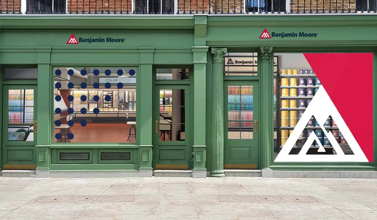
After 140 years, Benjamin Moore needed a brand refresh — the companies line “See the Love” needed to be brought through all visual touch points along with an updated color palette, mark, look and feel.
Basing the grid system off their paint chips allowed us to create a flexible system, that worked across all their assets. While creating the grid system we created the concept of framing images with color, allowing Benjamin Moore to highlight the scope of their color library. From there we established typefaces, color palette and a brand book, these all came together to create assets for Benjamin Moore’s team to roll out internally.
Role: Brand Identity, Art Direction & Graphic Design
Agency: FIG


ECD: Justin Walsh